Live in the Best Place
An App to Rank Cities based upon user selected factors
Project Roles and Objectives
This project was put together over the course of eight weeks by a team of 14 students with four disciplines - UX, iOS, Full Stack Web, and Data Science. We took two weeks to plan, five weeks to build, and one week to clean our documentation. Aside from myself, there was one other DS member on the team. I did a lot of the initial data cleaning and took on the task of building a model for sorting cities by multiple factors. Later, I also adopted the task of creating data visualizations. My DS partner worked primarily on our Data Science flask API to connect our model to both the iOS and web app teams. I spent most of the five weeks of build-time alternating between Jupyter Notebooks and pair programming with my DS partner to integrate our model into our API.
After a day of initial data wrangling, I cleaned and reduced the size of our data. We anticipated limitations to our photo hosting and speed while pulling from our app's two independently developed back-ends. Although based upon our initial set of data our app could be scaled up to include over 3,000 US cities larger than ten thousand, we decided to use a lighter and more manageable data set for short build time. Our API would give our web developers access to 189 city features ranging from: crime and safety ratings, economic growth factors, school ratings, diversity, air quality, etc., and cover the largest 256 cities in the US with populations of 100,000 or more.
First Steps: ranking cities by multiple factors
The overall goal for the first release cycle was for our model to return a list of top recommendations based upon factors a user selected as important. The hope was to eventually add sliders to each selected feature, to be able to weigh the relative importance of each factor. Even with this relatively tiny data set, even without improving the model, the number of possible ranked lists based exceeds 3*10³⁴⁹; my team needed a live model.
First I created a simple function using pandas manipulations.
# returns df filtered by quantile of factors

def rankify(df, factors, top=10, quant=.75):
	df_copy = df.copy()
	for i in factors:
	   	df_copy = df_copy[df[i] > df_copy[i].quantile(quant)]
		df_copy['score'] = df_copy[factors].mean(axis=1)
		df_copy = df_copy.sort_values('score', ascending=False)
	return df_copy['name'].head(top).tolist()
For a given input dataframe and list of factors, the above function takes only the cities that appear in the intersection of the top 25% for each of the factors listed. In other words, a city with a low score in any of the categories listed is axed from the list. From there, a mean is taken across each row to provide a relative score for comparing to other cities, and cities are sorted by the resulting values.
Although the results from this initial function had some pretty glaring issues, by handing over this minimally viable product to my team, they were able to start working on integrating it into our app, while I improved my model and further cleaned my data.
Issues to Resolve
1. Different factors were on vastly different scales. For example, population might vary on the scale of millions, while economic growth usually varies on partial percentages. Initially, whichever factor had the biggest numbers had the biggest influence on the overall rank. To begin to fix this, I used a min-max scaler, shrinking values for all factors to a range of zero to one.
2. While I pushed these slight improvements, another issue occurred to me - distribution. Since distributions were not all skewed in the same direction, comparing the upper quartile of each factor once again resulted in a varied range. This time, the model favored factors with a right skew in distribution. I then turned to a robust scaler, that redistributing each quartile, but the results were still somewhat biased towards certain initial distributions.
#Transforming data to compare factors fairly
import numpy as np
from sklearn.preprocessing import MinMaxScaler
# from sklearn.preprocessing import StandardScaler
from sklearn.preprocessing import RobustScaler
from sklearn.impute import SimpleImputer
# Instantiate
# scaler = StandardScaler()
mms = MinMaxScaler()
rscaler = RobustScaler()
#Isolate numeric columns
numeric = robust_df.select_dtypes('number')
x = numeric.values
# Impute NaNs with means
imp_mean = SimpleImputer(missing_values=np.nan, strategy='mean')
imp_mean.fit(x)
SimpleImputer(add_indicator=False, copy=True, fill_value=None,
missing_values=np.nan, strategy='mean', verbose=0)
x = imp_mean.transform(x)
# Scale / Normalize / Standardize
# x_scaled = scaler.fit_transform(x)
x_scaled = rscaler.fit_transform(x)
x_scaled = mms.fit_transform(x)
df_temp = pd.DataFrame(x_scaled, columns=numeric.columns, index = robust_df.index)
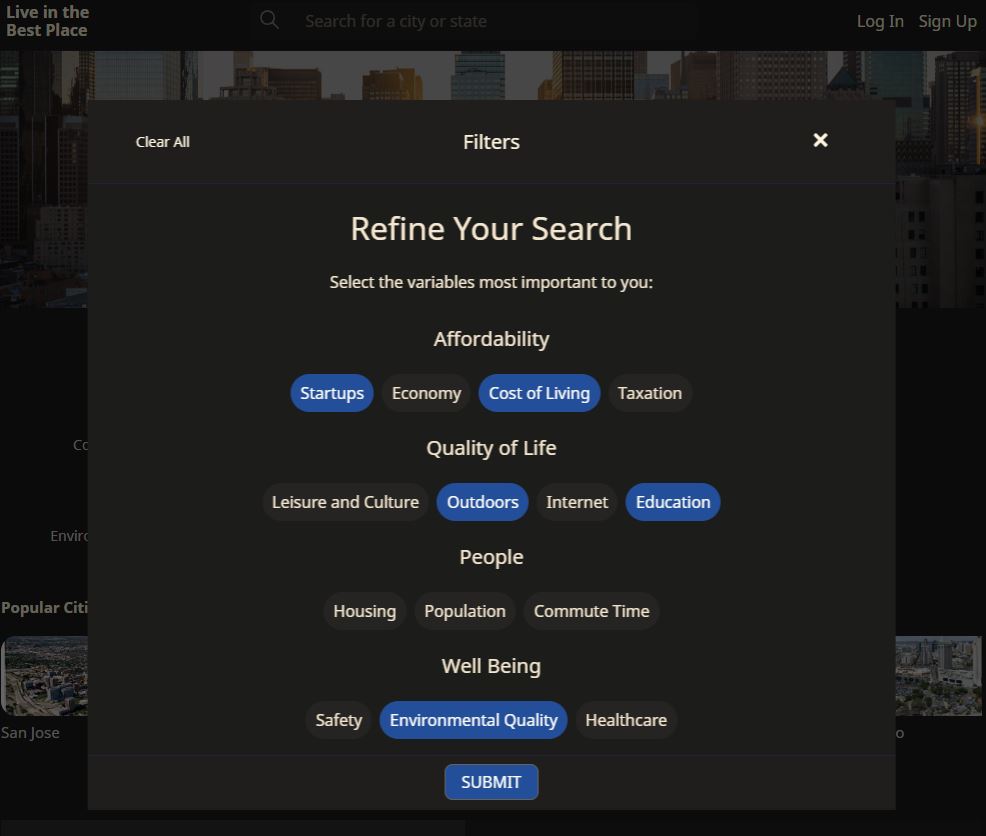
robust_df[numeric.columns] = df_tempEven while the scale was made the same between factors, the skew of distribution was widely different from one factor to another. If a factor had a strong right-skew (left leaning) distribution, then the resulting upper quartile had a bigger range than if it were left-skewed. This gave more influence to factors with right-leaning distributions. I had to find a way to create perfectly uniform distributions for each factor.
A simple solution to produce a flat distribution
Finally, it occurred to me that what I was looking for was a flat distribution which could be accomplished much more easily by ranking each factor using pandas own built-in .rank() function. In this way, each factor had scale between 0 and 1 with each city equally distributed in percentile rank. When plotted, the distribution became square.
By the time I had resolved these issues with data distribution, my Data Science partner had developed a rudimentary flask API, deployed it on Heroku, and was serving results from my initial function to the Front End of our Web Dev team. Even while the initial results were nonsensical, the team was able to build around the model until it was improved. Updating the database to improve the results was a seamless push, with a complete separation of our respective concerns. Then when the average was taken across multiple factors no bias was given.
Release Cycle 2: Data Visualization
After experimenting with color pallets and other package versions of a vertically stacked bar graph, I decided to do something a little more unique with my data visualization. I really like the way violin plots make it easy to compare distributions of a handful of factors all at once.
My first iteration was the most simple - a vertically stacked bar chart using Plotly. A user could see, for example, that Portland ranks higher than Pittsburgh when combining each selected factor, but that the cost of living and economic growth rates are far superior in Pittsburgh.
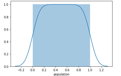
First I started by graphing one Violin Plot using the Seaborn library.
import seaborn as sns
sns.set(style="whitegrid")
ax = sns.violinplot(x=redu_df['avg_commute_time'])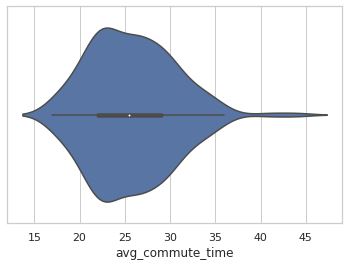
Although the above Seaborn violin plot is essentially the same as a Kernel Density Estimate plot, the mirrored effect in combination with an overlay of a box plot gives a user a lot of information in one spot. Here we see that the medium of average commute times is just over 25 minutes, while the vast majority of average commute times for our 256 cities is below 35 minutes. We can see that there are few outliers to the extreme right where some city's commuters spend about 45 minutes on average.
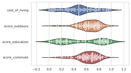
Comparing multiple factors first required standardizing the data. Otherwise, the distributions would not be on the same scale. For example, income tax data rate would be mostly in the hundredth's place while commute time would be about three orders of magnitude bigger - not the most visually accessible graph.
x = ['cost_of_living', 'score_outdoors', 'score_education', 'score_commute']
sns.set(style="whitegrid")
g = sns.catplot(data=norm_df[x], kind="violin", split=True, height=4, aspect=1.5, orient="h");
A user can take the top handful of factors and compare the distribution of those factors between all cities under consideration. For example, cost of living appears to be a fairly bell-shaped distribution, while education is bipolar.
Next I played with the same information in a slightly different format, known as a swarm plot.
import matplotlib.pyplot as plt

ax = sns.catplot(data=norm_df[x], kind="swarm", split=True, height=5, aspect=1.5, orient="h");

plt.axvline(x=.7)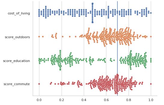
Although, again this information is essentially nothing more than a distribution plot, swarm plots are especially good at accessing a visual understanding of where clusters are in the data. Looking again at the bipolar distribution of education ratings, for example, with this plot one can see that there is a rather large cluster to the left around 0.2, tapering out slowly toward the center. Whereas on the right side of the education distribution there appears to be a push to be in the top 25%. While the violin plot is more immediately accessible, it smooths out these nuances.
So, why not combine the two graphs? Doing so is no more complicated than calling them both on the same axis and changing the colors of the overlaid plot.
My UX designer decided that these plots were too difficult to interpret and asked me for something that was more easy for a user to understand. After some back and forth, we came up with the idea of a "slug plot". I went back to MatPlotLib to get extra control of the fine graphing details.
import scipy.stats as stats
import numpy as np
import matplotlib.pyplot as plt

def displot(df, city, factor):
	fig, ax = plt.subplots(dpi=200)
	plt.style.use("seaborn")

	# Turn off tick labels
	ax.set_yticklabels([])
	ax.set_xticklabels([])

	# dist = redu_df['score_outdoors'].copy()
	kde = stats.gaussian_kde(redu_df[factor])

	# plot complete kde curve as line
	pos = np.linspace(redu_df[factor].min(), redu_df[factor].max(), 101)
	plt.plot(pos, kde(pos))

	# find value x of factor in specified city
	x = redu_df.loc[redu_df['short_name'] == city][factor].tolist()[0]]

	# plot shaded kde only left of x
	shade = np.linspace(dist.min(), x, 101)
	plt.fill_between(shade,kde(shade), alpha=0.6)

	# plt.figure(figsize=(3,1))
	fig = plt.gcf()
	fig.set_size_inches(6, .8)
	plt.ylim(0,None)

	# plt.show()
	plt.axvline(x=x, color='black', lw=2)

	moo = int(round(ranked_df.loc[ranked_df['short_name'] == city][factor].tolist()[0], 2)*100)
	text = "{}'s {} Percentile: {}%".format(city, factor, moo)
	plt.xlabel(text)

	return plt.savefig('testplot.png')

# example
plot(df=redu_df, city='Portland', factor='score_outdoors')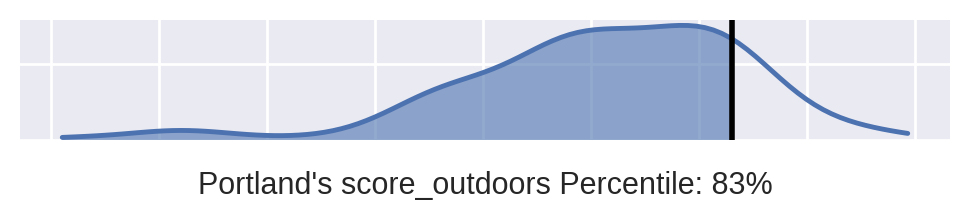
MatPlotLib is always turns into a lot of code, but it's my go-to when I need to really fine tune a graph. The idea of my "slug plot" distribution was that I could build it into a function and produce however many of the plots needed for a given city and a list of important factors. Being squished horizontally, my web folk could provide the user with a number of stacked distributions for easy comparison. Well, my web folk thought it was too boring, plus they didn't want to have to deal with designing around multiple graphs being called to the front end.
It was back to the drawing board again. I was asked to make a visual that compared multiple factors for a given city with as much bang for my buck in a single API served data visual. So I once again used MatPlotLib to make this:
import numpy as np
import matplotlib.pyplot as plt


def radar_plt(df=ranked_df, city=city, factors=x):
	test = df.loc[df['short_name'] == city][factors].T.reset_index()
	test.columns = ['theta', 'r']
	test['r'] = test['r']*100
	test['theta'] = test['theta'].replace('_', ' ', regex=True
		).replace('score ', '', regex=True
			).replace('ranked ', '',
			regex=True
			).str.title()

	test

	plt.style.use("bmh")

	fig = plt.figure(figsize=(10,10))
	ax = fig.add_subplot(111,polar=True)
	ax.spines['polar'].set_visible(False)

	rank = test['r']
	# sample = np.random.uniform(low=0.5, high=13.3, size=(15,))
	N = test['r'].shape[0]
	# colors= '#f51646'
	# colors = plt.cm.PuRd(test['r'] / 10)
	# colors = plt.cm.viridis(test['r'] / 100)
	colors = plt.cm.GnBu(test['r'] / 150)

	width = np.pi / N*1.8
	theta = np.arange(0, 2*np.pi, 2*np.pi/N)
	bars = ax.bar(theta, rank, width=width, color=colors, alpha=0.9)

	ax.yaxis.grid(True)
	ax.set_xticks(theta)
	ax.set_xticklabels(test['theta'], fontweight='bold', fontsize=12)# , fontname='FontAwesome')

	# puts % on y tick labels
	y_label_text = ["{}%".format(int(loc)) for loc in plt.yticks()[0]]
	ax.set_yticklabels(y_label_text)

	# rrr = redu_df.loc[redu_df['short_name'] == city][x].tolist()[0]
	# plt.axvline(x=rrr, color='black', lw=2)

	# print(["{}%".format(int(loc)) for loc in plt.yticks()[0]])
	# return plt.show()
	return plt.savefig('radarplot.png', dpi=400)


# Example:
city = 'Portland'
x = ["score_commute", "score_cost_of_living", "score_economy", "score_education", "score_environmental_quality", "score_healthcare", "score_housing", "score_internet_access", "score_leisure_&_culture", "score_outdoors", "score_safety", "score_startups", "score_taxation", "ranked_population"]
radar_plt()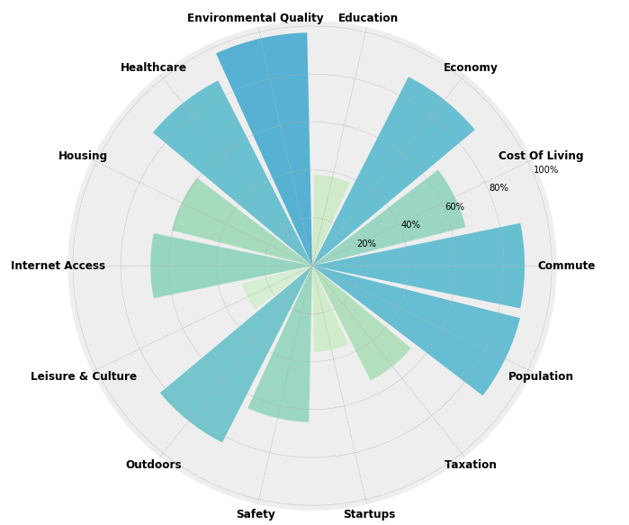
The radar bar plot above, for Portland Oregon, gives the percentile rank for a given input city for each specified factor. The color is set to be darker, thus more visible, for higher scores. This allows the user to immediately see which categories are a city's strongest suites.
In the following three weeks, my web design partners once again redesigned the data visual for this project and re-wrote the data visuals in our native Javascript back-end to increase the loading speed of our app. All that I contributed to this aspect of the project lives on in branch history and Notion documentation. Se la vie.